Powered by Blogger.
Showing posts with label interior. Show all posts

The perfect place for reading

Wednesday, April 8, 2015


Yesterday, I did something very unusual. Instead of reading books for self-improvement, which I do all the time I read a book just for pleasure. I had a copy of “Annie Leibovitz at work” back in Prague, but I read just separate parts of it. And yesterday I took a day off from my routine, stayed at home and read the book from cover to cover. And I felt incredible happy. When was the last time that you felt like that? 
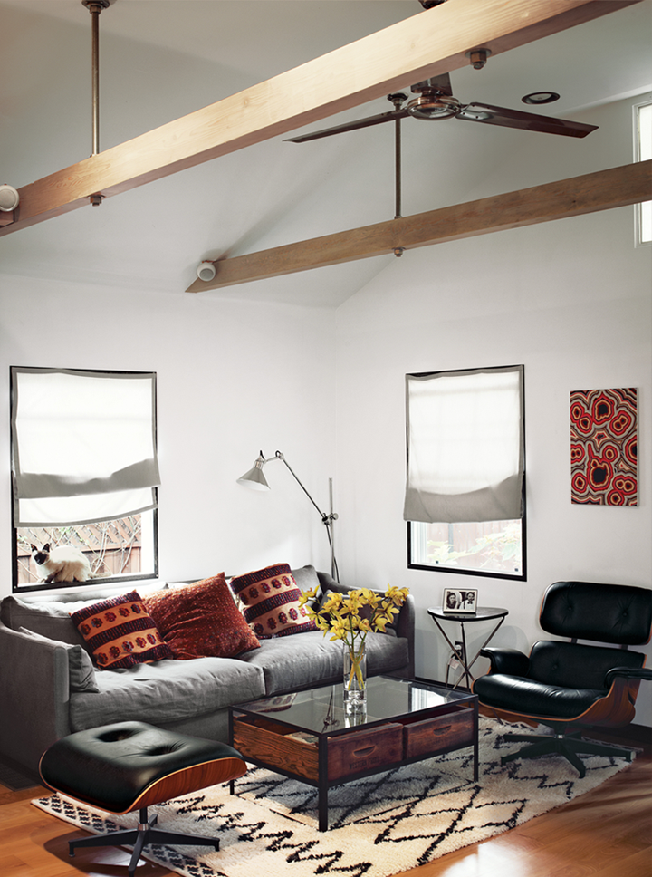
The only thing that would probably make me even happier is if I had the chance to read the book in a beautiful place like this one. That’s the perfect place for reading, don't you think? It is a part of a small guest house, but I found this corner so aesthetically beautiful.



photography: sean litchfield

Autumn ideas by H&M home

Wednesday, August 13, 2014


I believe that the time of the year when we have to turn slowly our head towards new ideas and decoration for our home is coming. Yes, and I mean to check the trends that will be popular this autumn. I know that most of us don't want to let the summer go just yet - but that’s the way how time works, we don't have the power to stop it and at the end of every season there is something beautiful. For the autumn - I love the textures, the soft blanket and the earth colors with their cozy feeling that only the fall could create. I love the colors of the leaves, the light is beautiful and yes… I love the autumn. 


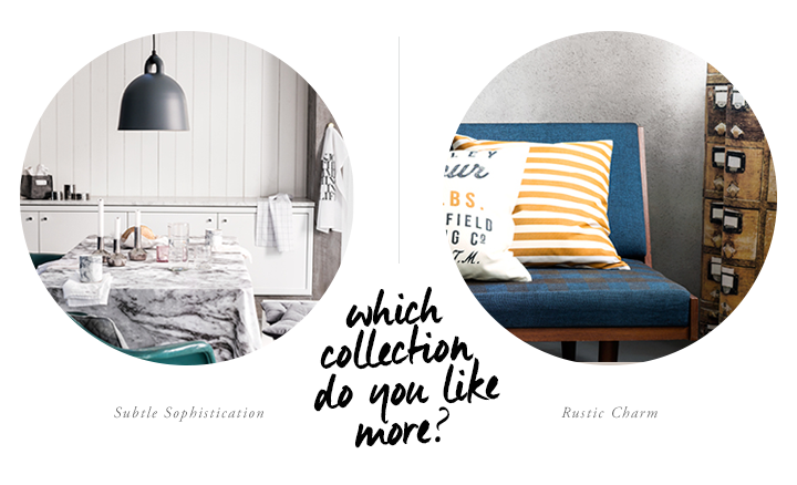
I’m ready to start my inspirational post series and to have a look at the most beautiful and inspiring for me home decor brands. And I will start with the Swedish H&M. I know that they are fashion brand and their home section offers only textile and small home decor accessories; I know that one of their collection is dedicated to the marble, which I think is a trend that is slowly going to its end because we saw so much marble everywhere. The reason that I started with them is that they chose an amazing stylist to represent their items. That is Hans Blomquist who usually incorporates in his work the most popular trends. I chose for you the Rustic Charm collection where the beauty of the nature is mixed with chalky neutrals and rustic styles. Wood, heavy knits, washed linen and flannels.


photography: h&m

Scandinavian summer house

Monday, August 11, 2014


Hello friends,
How was your weekend? Did you spend it somewhere in the nature? 
Here I have for you a beautiful Scandinavian summer house. It is very simple, clean and inspiring. For me the most interesting part here is how easily is the nature invited inside and I imagine the life in this house as a pure appreciation of the simplicity and functionality. There’s no unnecessary furniture, the decoration is not bought in the nearest interior shop - it is taken from the forest. The kitchen is small and functional as well and ready for serving healthy grilled and fresh food. It looks like this wooden house is ready to offer summer happiness and lovely memories with friends and families. 
By the way it belongs to the family of Tine K - the owner of the popular Danish home decor brand. 


photography: morten holtum for bolig

A little escape to Southwest France

Wednesday, July 23, 2014


I wanted to write a design mix post today with the beautiful items that I found pretty recently, but I couldn’t. Not after I saw this amazing place that makes me dream for vacation and France. This is the place where the fashion designer Julia Leach from the brand Chance relaxes, recharges her batteries and gets inspired. Dorodgne (near Bordeaux in Southwest France) is the place where this lovely stone house is located and inside is like a summer dream to me - white, simple but with plenty of old furniture and accessories from the past.  I can totally imagine how recharging everything is there. 


Enjoy these beautiful pictures from Lonny magazine. And if I have to mention some practical ideas that all of us could borrow for our modern homes – it would be the open kitchen shelves. They look so stylish with that glass and ceramic on them, don’t you think?


photography: mark eden schooley for lonny magazine

You better be ready for the weekend because we are going to Italy

Friday, July 18, 2014


So it is Friday again, yey! Do you have plans for the weekend? I will probably visit a craft fair, popular coffee shop here in San Francisco and I have some plans to take some photos and if I still have some time left (which I doubt) - to retouch some photos which are waiting in my to-do list.

So we should celebrate the end of the week by taking a look at this beautiful Italian villa. Simple and cozy, in the heart of Tuscany and you can discover some very beautiful design pieces there. What I love the most there though is the mood that this places evokes. No pressure, everything is simple, clean and close to the nature.


photography: julie ansiau for elle decor via: remodelista

Smart bedroom idea for tiny apartments

Wednesday, July 16, 2014


Look what a great idea I found today, browsing through the pictures of Vincent Kartheiser’s Hollywood cabin on Dwell. There, the designer Finn Roberts, whose family by the way were carpenters and builders, creates a very nice bedroom suitable for tiny spaces. The bed was designed to hang from the ceiling and can be hoisted up and pulled down as needed. Clever, right?

Oh, and don’t forget to check out the other corners of this lovely home. They are pretty interesting too.


photography: joe pugliese for dwell

Summer atmosphere and the folding chairs

Monday, July 14, 2014


I know it is Monday, but I thought some summer atmosphere created by the great duo - Lotta Agaton and Pia Ulin would add a pinch of good mood and inspiration, right? 
I like the combination of solid wood, white and here we see it back in action. However, to me the most impressive are these folding chairs designed by Mogens Koch. Did you know that they are actually designed for a competition for church interior? In 1932 this idea obviously was not so popular and the chairs were not successful back then... but in 1960 and later in 2013-2014 they are an absolute hit. I personally adore the version with the caramel colored leather.


photography: pia ulin for residence magazine

Smart idea that can eliminate the colorful mish-mash on your bookshelf. If that bothers you.

Tuesday, July 1, 2014


If you are fan of books like me probably you have many books on your bookshelf and they all have different cover colors. In my case that is a bit of a problem, because I am visual persons and good color combination is very important for me. So my colorful bookshelf has always been a problem for me and the only thing that saved me was to create my own book covers and wrap every single one of my books. But today I discovered ( thanks to the swedish blog Trendenser ) that there is another way how to do it…very simple yet very useful. Just turn your books with the papers out and voila - you have a nice looking bookshelf that won't distract you anymore. Yes, there is a negative side in all that - you can't see the name of the book. So if it is not a problem for you - go for it. In case that you want to see the names of the books - very soon I will make a DIY tutorial how you can achieve that easily.


Aко сте любител на книгите като мен, със сигурност имате много книжки в библиотеката си с най-различен цвят на корицата. В моя случай това е малко дразнещо, защото аз съм визуална личност и цветовите комбинации имат значение за мен. Така че прекомерния колорит в библиотеката си ме дразнеше определено и се налагаше да си правя свои собствени корици за книгите с дразнещи корици. Но днес, благодарение на шведския блог Trendenser, аз открих, че съществува и друг начин - по-семпъл и по-лесен. Просто поставяш книгата в библиотеката с корицата навътре и готово - сега всичко е в един нюанс. Недостатък тук е това, че така не виждаш заглавието на книгите, но пък убиваш цветовия дразнител намясто. Така че, ако това е приемлива ситуация за вас - възползвайте се. Ако ли не - много скоро обещавам да ви направя специален туториал за това как да си правите сами свои собствени корици. 


photography: swedish mäklarhuset

Summer house in South Africa

Thursday, June 26, 2014


Let’s escape today. Let us take the direction to South Africa, where this beautiful summer house is located. The home is really inspiring with the successful natural color palette with lots of wood, stone and great textile. Casa Sanchia is designed by the architect Marco Bezzoli one of the founder of Archilab studio and was on the cover of the november issue of the Home & Leisure magazine. The beautiful photographs was taken by Anton Robert.


Three Great DIY Ideas to Try in Your Worspace

Wednesday, June 25, 2014


One of my most favorite places at home is the workspace. I work a lot. And this mean that I spend a lot of time in the working area so I'm constantly looking for interesting ideas how to change it, to make it more creative, beautiful and comfortable. 

Today I selected three different DIY ideas that I would like to do myself for my new workspace. Here they are: 


The first idea comes from the Finish blog Bambula and the original idea was for a kitchen towel. In my case I will use it to hang there my photos, magazines or books that I read. I think that it looks awesome, I just have to decide what kind of metallic color  to choose. 


The second idea for DIY for the workspace is coming from Merry Mishap blog. She created a simple yet really pretty black ladder on which she can hang magazines, scarves and other textile. I love the ladder idea in the workspace. Long time ago I had one too and I really liked it. Probably I won’t make it black, but will try to find light texture of wood or just make it white. 


And the third idea is also lovely. It comes from Monsters Circus, where Mette shows how with some wire fence you can create gorgeous storage options. Here I will have to decide again what color to choose so the idea from the first DIY to match to that wire storage. 


Oh and if you noticed some strange things happening on the blog - don’t worry. I just finally found the time to pimp my design. And because I’m trying some new things… sometimes strange things happen - like for example unexpected changes in the font, or not aligned design element. But don't worry - very soon everything will be fixed and I will have a beautiful new re-designed 79ideas. :)

photography: first idea / second idea / third idea 

Looking for Dining / Living Room Ideas

Sunday, June 22, 2014


In my new home I have a big beautiful two-leaved door that connects the living area with dining space. So I was looking for some more inspiration how to create these two spaces attractive… I almost furnished my dining area but I have a completely empty living room and so many ideas that confuse me a bit. Should I create it white, or can I add a grey sofa. And what about the arts on the wall? 


Anyway… I will leave my thoughts for later and will be inspired by this Swedish apartment that has also a similar beautiful two-leaved door. In the dining area I love the lights - I found them a bit unpractical - imagine having a fondue dinner with fire on the table… nevertheless they’re so beautiful. And what you think about the living area? The art behind the sofa is really gorgeous.LIVI


photography: bo-laget

Get Inspired and Add a Touch of Blue in Your Home

Wednesday, June 18, 2014


Is blue your color? 
I discovered for myself that I change my mind very often when it comes to colors. Today I might love yellow, tomorrow green and so one. But there is one color that I constantly like (except white and black which are my favorite obviously) and this is blue. Polly Wreford photographed these beautiful images styled by Sarah Keady for Red magazine. The blue accent is achieved with the textiles, the flowers and the table plates. Personally I love the ladder as a place to store textile and I think that I might use it too in my small bathroom. I just have to find the right one.


photography: polly wreford for red magazine

Small Girly Apartment with Smart Ideas

Tuesday, June 17, 2014


If you have a tiny apartment with lack of space, probably you are constantly looking for smart space saving ideas. So am I. Here I have a great example for girls… white one-bedroom apartment, where the bedroom is actually… hidden into the wardrobe. You open the door and the bed jumps in. This is clever, because the only room that you have should look more like living area instead of mixture of living, dining space and bedroom. I love the pastel accents here and there but most of all I like the gorgeous mix of white and wood and the usage of empty, but beautiful old crates. So… how do you like the space?


photography: fantastic frank